For the best experience, please view this project on a desktop.
Where Sense
meets Structure


Navigation ReDesign
role :
Product Designer
Timeline :
January 2023 - April 2023
This project was part of my graduation work at Nykaa, an E-retail brand. It involved a 4-month effort to improve the growth and retention by creating navigation structure that increases user conversion rate. The goal was to prioritise users' needs and preferences in creating intuitive and efficient solution.
This is an independent work and does not form a base to any previous works.
Design System
Product Design
UX Design
UX Research
Top Navigation Revamp
Why should
Nykaa’s navigation be restructured?


Enhancing Visual Hierarchy
Challenging product discovery and information scanning that interrupts user to convert into customer.
Design Aspect
Improving Engagement Metrics
Increased drop-offs due to a complicated user journey, leaving users feeling lost in the app.
Business Aspect
Developing Interaction
Inconsistent components leads to tech debt and also non-reusable components.
Technical Aspect
Attaining Acquisition, Attention and Retention
objectives
Consistency and Standards
Maintaining consistency for clarity and ease of use to adhere to established standards.
Recognition rather than recall
Making sure that users remember details from one part of the interaction to another to avoid user journey confusion.
Minimal design
Promoting simplicity and efficiency by eliminating unnecessary information.
Design Clear Interactions
Clear and consistent interactions across the screens.
Hierarchical Design Language
Adding visual hierarchy to quickly identify the primary, secondary, and tertiary CTAs.
Heuristic principles
Optimising usability by minimising design deficiencies
How might we
Resolve the discrepancies and improve user experience

Golden Circle
Research Model
By starting with identifying the opportunities, setting strategies that directly support your goals, this model is focuses first on the "why" of what they do, then moving outward to the "how" and "what."
Research
Structure :
Opportunity, Strategise, Action
Why ?
Why there should be a higher conversion rate?
Why are users lost while using the application ?
Why are the user’s drop off rates increasing ?
How ?
How do we develop a structure ?
How do we provide helpful icons in the header ?
How do we develop structure consumes less space ?
What ?
What are the features/ content that should be included ?
What should be the navigation layout in context the page content ?
Quantitative Statistics
Deriving insights from:
User Interaction Patterns and Behaviours
Navigation Type
Monthly Visits
% Visits overall
% Visits products
Search
Wishlist
Cart
Categories
Offers
18,30,005
6,78,264
13,78,264
15,30,615
5,63,358
4.7%
1.0%
2.2%
2.3%
0.9%
80% - 84%
46% - 48%
60% - 63%
65% - 68%
56% - 59%
Affinity map
Analysing :
Challenges, Behavioural Needs, Suggestions
Mapping what the user wants
Challenges
Difficulty in Navigation
Lost user experience in the app
Non-descriptive and unclear navigation labels
Frustration and annoyance with the experience
Confusing and Inconsistent hierarchy
Behavioural Needs
Ease in finding what is being searched
Simple and easy to comprehend
Clear and concise navigation labels
Work seamlessly across devices.
Consistent and intuitive navigation hierarchy.
Suggestions
Simplifying the navigation structure
Removing unnecessary categories & icons
Using clear, concise and descriptive labels
Maintaining Consistent hierarchy that is intuitive
Satisfying the needs and expectation of users

iOS Navigation bars
Describe current window to provide useful context.
Concise title aiming for a word or short phrase.
Distraction-free experience as intend is to inform.
Use system-provided back button chevron.
Use standard components in a navigation bar.
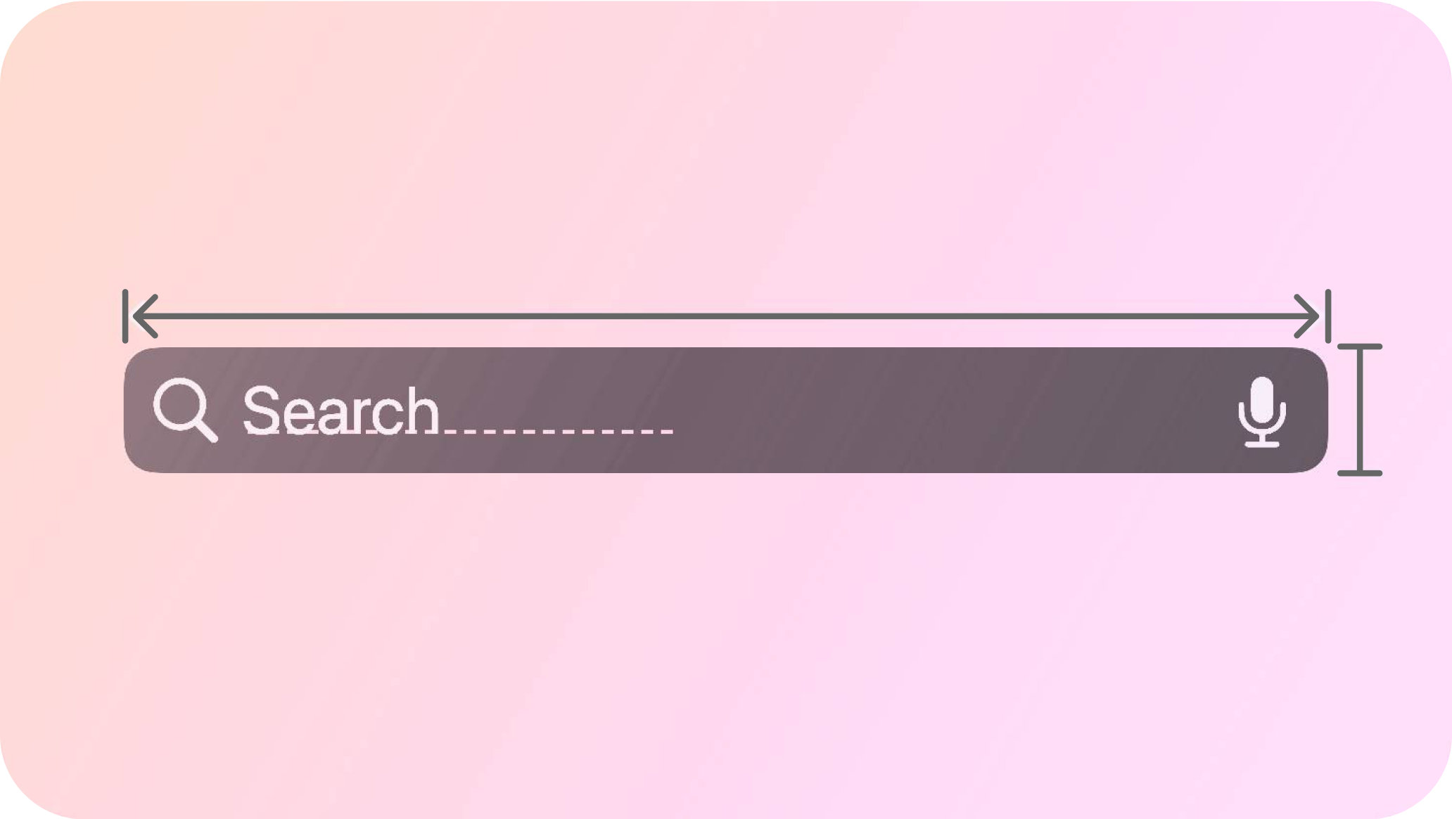
Search Bars
Display placeholder text that describes the type of information people can search.
Provide relevant items near a search field so people can select them instead of searching.

Container 3. Leading Navigation Icon
Headline 4. Trailing Interactive Icons

Android Navigation bar
Content and actions related to a current screen, such as navigation, screen headlines, and actions.
Contextual and specific to a screen action and information.
comprehending
Design System Guidelines


Consistency • System Design
Minimal • Concise
Interaction • Minimal • Clear c


Inconsistent design system
Discrepancies in page scroll interactions
Misaligned page title with the page content
Difference in header alignment, space and size
Missing Icons interrupting user journey
Inconsistent design system
Discrepancies in page scroll interactions
Misaligned page title with the page content
Difference in header alignment, space and size
Missing Icons interrupting user journey
Current Nykaa App
The Redesigned App
Breaking down navigation bar consisting of
sub-components
Icons
Primary Icons
Search, Wishlist and Cart
Highly impacts the user retention in the application
Secondary Icons
Voice Search, Notification, Back Chevron, Dropdown
Adapts to the page's content and purpose, considering the experience
Bottom Navigation Icons
Home, Offers, Category, Stream (now Play), Account
Specifically focus on easing the process of customer acquisition and discoverability

Left aligned header with defined set of primary icons
Page Title
Page Title
Left aligned header with
page title truncated
Page title for th…
Page title for…
Page title with subtile especially for stating number of products
Page Title
Subtitle
Page Title
Subtitle
Page Header
Defining:
Consistency, size and alignment

